

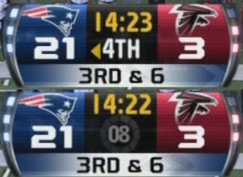
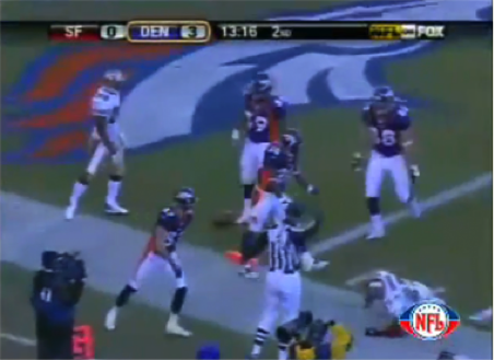
FOX debuted a new NFL score graphic last night. This is what it looks like.
I really don’t have any feedback positive or negative, but will say it looks like this new design could potentially hide a top side safety so that might be not ideal. The numbers are bigger so I imagine less squinting for many.
This is last year’s FOX score graphic.
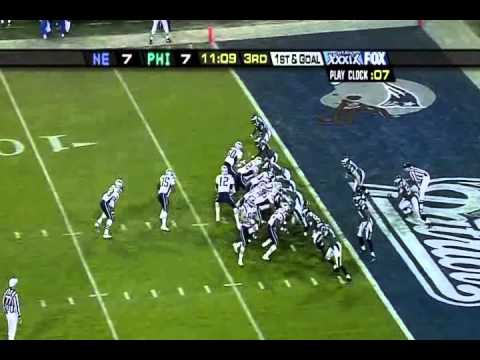
And before that, from 2012.
This is from 2009 when Fox was going through their full top bar phase…
And 2006…
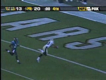
2004 Season but showing the 2005 Super Bowl. Not a fan.
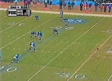
2003. This game didn’t go to overtime because of a missed extra point. I love football.
In 2000, the FOX logo was nearly as big as the score, which you might need a magnifying glass to see.
And then we have 1994, FOX’s first year with the NFL. Up until this, no network partner had a continuous score graphic on screen.
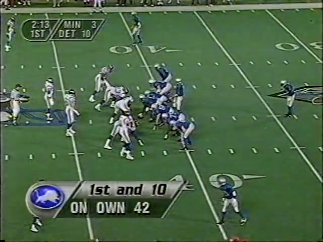
Looking at these for way too long, I’m a fan 0f the 2012 version. Team logos, timeouts, play-clock, down and distance, possession arrow, and pretty much everything you could want. Plus, it’s a little softer on the eyes than the revamped version and last year’s. I’m glad the days of the bar across the top are gone. My only request is that they should totally have some type of indicators on if the winning team is covering the spread and how many points until the game reaches the over/under.
It’s probably not going to happen but if a network were to go that route, it would definitely be FOX.
Comments are closed.